By: Haley Gamertsfelder And Meg Wickless
In the Spring semester of 2016, two University of Maryland undergraduates, Meg Wickless and Haley Gamertsfelder, continued work on the Sentinel Apiary Project’s pollen analysis. In 2015, participating beekeepers sent in biweekly samples of pollen collected with a pollen trap throughout the months of May, June, July, August, September, and October. Once these samples reached the lab, they were stored to be sorted, which is where we, the undergrads, come in.
Combined, the two of us spent about 120 hours in the lab working on this project.
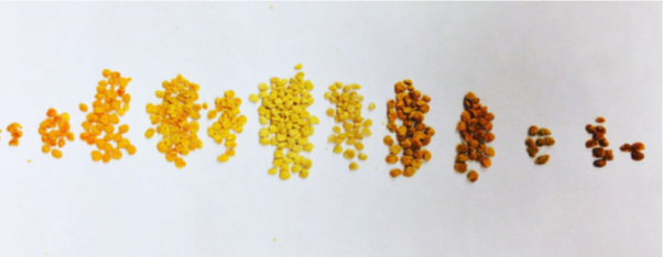
Our job was primarily to sort the pollen samples out by color. After weighing out 3 grams from the beekeeper’s sample, piles were made of every color we could identify. Each pile of different colors were weighed and, again, stored in small tubes. When we weighed and stored each color, we coded each color to its correct mass by an assigned number. We learned the hard way that this was not the most efficient course of action. When it was time to analyze the data, we had to dig through all our sorted samples (well over 100 little plastic baggies in one huge freezer drawer) and assign a color in place of the number to every tube in every sample. So, a note to future students working on the project: assign colors immediately! When data was analyzed, recorded, and put into pie-chart form, we were able to see the nutritional diversity of multiple colonies and how each colony’s diversity changed over time. Because the only data we were working with was pollen color and mass, we had to assume that a diversity of pollen colors was equal to a diversity in the bees’ diet and which/how many amino acids they were consuming. We felt that we could assume this because different species’ of plants vary greatly in terms of what’s in their pollen. Protein content alone can vary from 2.5% to 61% between different plant species, and on top of that, different species contain different amino acids.
Bees need a healthy amount of protein, and enough of all the amino acids they need to survive, which is exactly why the information we obtained could be useful. If bees aren’t getting everything they need, nutritionally, beekeepers often supplement their colonies. From what we’ve determined, we can tell with some degree of confidence whether or not a colony needs a supplement, but we can’t tell what a beekeeper should supplement with. In order to know that, we would need to trace each color of pollen back to a specific plant, so we could know how many of each amino acid a colony is getting. That is most likely the next step in this research - tracking down which pellet of pollen came from which species of plant.
In our end-of-semester wrap up, we chose to highlight 3 particular apiaries as a representation of our project in whole. The samples we were provided had a designation indicating the apiary or bee keeper they came from. The three whose results we are going to share were from SAAK in Allegany County Maryland, SAAJ in Blount County Alabama, and SAAF, in Montgomery County, Maryland. We chose these particular samples out of many others due to their abundance of samples.
Combined, the two of us spent about 120 hours in the lab working on this project.
Our job was primarily to sort the pollen samples out by color. After weighing out 3 grams from the beekeeper’s sample, piles were made of every color we could identify. Each pile of different colors were weighed and, again, stored in small tubes. When we weighed and stored each color, we coded each color to its correct mass by an assigned number. We learned the hard way that this was not the most efficient course of action. When it was time to analyze the data, we had to dig through all our sorted samples (well over 100 little plastic baggies in one huge freezer drawer) and assign a color in place of the number to every tube in every sample. So, a note to future students working on the project: assign colors immediately! When data was analyzed, recorded, and put into pie-chart form, we were able to see the nutritional diversity of multiple colonies and how each colony’s diversity changed over time. Because the only data we were working with was pollen color and mass, we had to assume that a diversity of pollen colors was equal to a diversity in the bees’ diet and which/how many amino acids they were consuming. We felt that we could assume this because different species’ of plants vary greatly in terms of what’s in their pollen. Protein content alone can vary from 2.5% to 61% between different plant species, and on top of that, different species contain different amino acids.
Bees need a healthy amount of protein, and enough of all the amino acids they need to survive, which is exactly why the information we obtained could be useful. If bees aren’t getting everything they need, nutritionally, beekeepers often supplement their colonies. From what we’ve determined, we can tell with some degree of confidence whether or not a colony needs a supplement, but we can’t tell what a beekeeper should supplement with. In order to know that, we would need to trace each color of pollen back to a specific plant, so we could know how many of each amino acid a colony is getting. That is most likely the next step in this research - tracking down which pellet of pollen came from which species of plant.
In our end-of-semester wrap up, we chose to highlight 3 particular apiaries as a representation of our project in whole. The samples we were provided had a designation indicating the apiary or bee keeper they came from. The three whose results we are going to share were from SAAK in Allegany County Maryland, SAAJ in Blount County Alabama, and SAAF, in Montgomery County, Maryland. We chose these particular samples out of many others due to their abundance of samples.
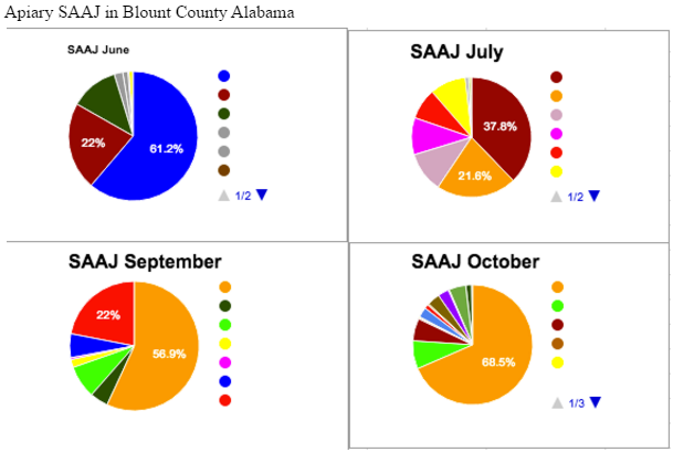
Apiary SAAJ saw the highest nutritional diversity in the month of July, and the lowest in the month of October. From this, we might assume that many favorable flowers were blooming in July, but perhaps only one favorable flower was still blooming come October. Colors of pollen were compared as accurately as possible between these 4 months, and each color of pollen was assigned a specific color on the pie chart, which remains consistent for all 4 charts. One interesting observation that can be made with this in mind is that the pollen represented by the color orange, we can refer to it as Pollen O, on the chart is one of a few dominant sources in July. However, when the other July sources mostly go away in September and October, the presence of Pollen O increases until it is almost 70% of the colony’s diet.
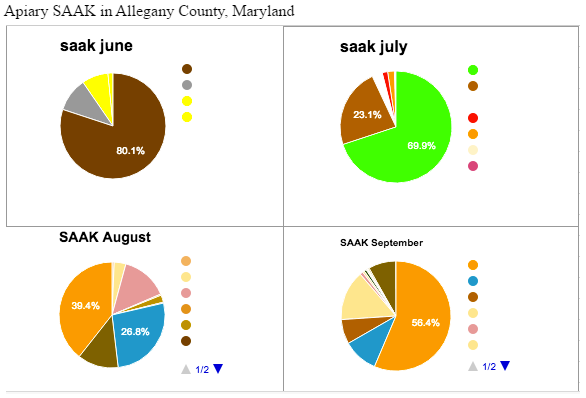
Apiary SAAK saw the highest nutritional diversity in the month of August, and the lowest in the month of June. This was puzzling since June is the end of spring/beginning of summer, we generally assume many plants are in bloom. Whether these results are because a bees preferred foraging sources were in bloom, so they relied heavily on those, or the reason being this area actually experiences low biodiversity in June, we can only guess. With this data the beekeepers over in Allegany County may choose to give their bees a dietary supplement in the month of June if this pattern persists.
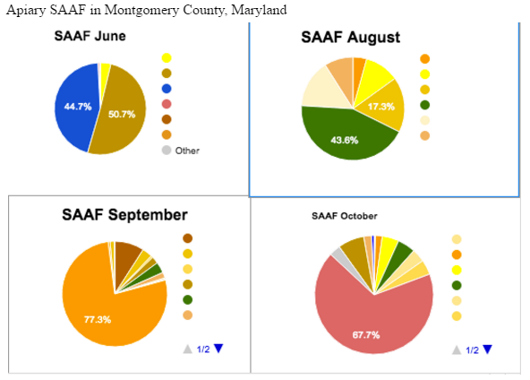
Apiary SAAF saw the most nutritional “evenness” in August, with high diversity in October. The bees in June relied almost solely on 2 foraging sources. Which as with Apiary SAAK seems to go against the laws of biodiversity. The colors on the pie charts indicate a different pollen color (while not matching the pollens color, as we had no bright blue pollen.) We assigned these colors to be able to watch the preference changes of the bees. As we can see with SAAF, the “green” pollen which seems preferred in August, becomes a minor source come September and October. This could be because other preferable sources became available or perhaps the plants producing “green” pollen stopped blooming.
While we were able to compile results to have a sneak peak into the foraging preferences of honey bees, more can be done. After we did our research we saved the sorted pollen in a freezer. Eventually this pollen can be viewed under microscope to determine exactly which species it came from. From this we can learn which amino acids or proteins are derived from the source, and what the bees are intaking.
Now that the semester is drawing to a close, we’d like to thank University of Maryland’s Bee Informed Partnership lab for giving us the opportunity to work on this exciting project!
 RSS Feed